Why Fires
Introduction
In an era of steep global warming and tragic wildfires, the project “Why Fires?” is a data visualization to provide insightful and statistical analysis of wildfires. Utilizing the dataset from NASA’s Fire Information for Resource Management System (NASA-FIRMS), the project visualizes occurrences of wildfires in the USA over two decades from 2001 to 2022 containing information such as latitude, longitude, brightness, confidence, date, time, etc., all captured by NASA’s MODIS instrument abroad the Aqua and Terra satellites.
The Visualization
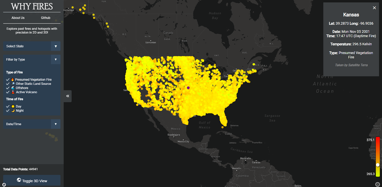
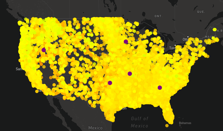
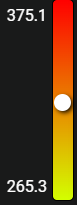
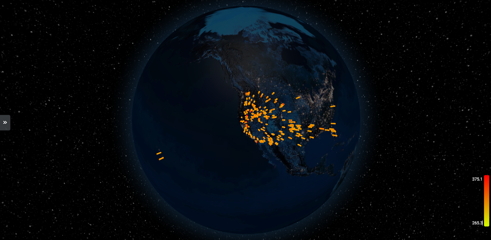
The “Why Fires?” data visualization has many interactive elements: data filters, single-point selection, and a heat range. The visualization can filter the data by state, type of fire (presumed vegetation fire, active volcano, other static land source, and offshore), and date/time. Upon selecting a single point, more information is provided on the top right and a heat range with a point on the bottom right to indicate the fire’s temperature compared to the rest of the data. Additionally, the map can toggle between a 2D and 3D view.
Visualization Takeaways
Key insights about wildfires in the USA between the years 2001 to 2022 include:
- The lowest to highest temperatures were from 264.3 K to 400.1 K
- 1,843 offshore wildfires occurred
- On average, about 74,526 more wildfires occurred during the day than the night per year
- Hotter fires were more common in the Midwest but a higher frequency of fires in the East. Notably, volcanic fires were primarily observed in Hawaii.
- A significant increase in fire occurrences over the years was observed
These takeaways were effectively generated with the use of our wildfire visualization.
Visualization Choices
The “Why Fires?” visualization used several design choices to better showcase the wildfire data:
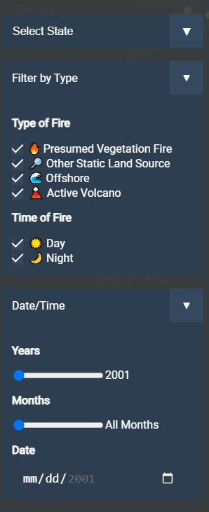
- Data filters: Interactive elements like sliders and checkboxes allowed users to focus on specific data points, tailoring the visualization to their needs.
- Color range: A color scale differentiates the intensity of fires, enhancing clarity and understanding.
- Point highlight: Clicking on a point on the map changes the point to purple, making it easier for the user to know which point was selected
- Interactive 2D/3D views: Users could toggle between 2D and 3D map views, offering different perspectives and a more immersive experience.
- User-Friendly Interface: The use of a dark theme and hideable elements made the visualization accessible and easy to navigate.
Team Contributions
Areas identified for future enhancement include:
- Expanding the Dataset: Incorporating global fire data could offer a more comprehensive view, though it may present technical challenges like data volume and processing speed.
- Improved Color Scale: Adjustments for a more consistent color scale, especially when filtering data, would enhance the visualization’s accuracy.
- Additional Graphs and Trends: Integrating more graphs to depict trends over time at state or country levels could offer deeper insights.
- Website Enhancements: More animations and interactive features could improve user engagement and experience.
Conclusion
The “Why Fires?” project visualizes trends of wildfires across various types. The visualization sheds light on crucial aspects of fire occurrences, their patterns, and potential impacts. Further development and expansion of the project could provide even more significant insights across the entire Earth.